
Distinctive Personality
Every artist dreams of his/her first solo exhibition at a recognized art gallery, as it usually establishes their art career.
Terrence Keller was no different. At the age of thirty one, he successfully launched his career as a formalist and abstract painter with a solo exhibition at the Edmonton Art Gallery in 1978. He showed a group of twelve paintings that were modestly scaled abstract works and characterized by figure-ground arrangements of crusted paint applied like calligraphy over tops of thinly stained grounds.
There was, however, an awkwardness to these paintings that made them difficult to appreciate at first. The artist’s handling seemed a little too “scrappy”, and the calligraphy had none of the fluid grace that would imbue it with “elegance” in the way that oriental calligraphy would. However, they wore well and what they lacked in elegance they made up for in visceral presence.
The featured paintings communicated a distinct personality – a personality that was original and “real.” His style, at this time, was described as calligraphy-on-stain-ground design.
Consider these early works:
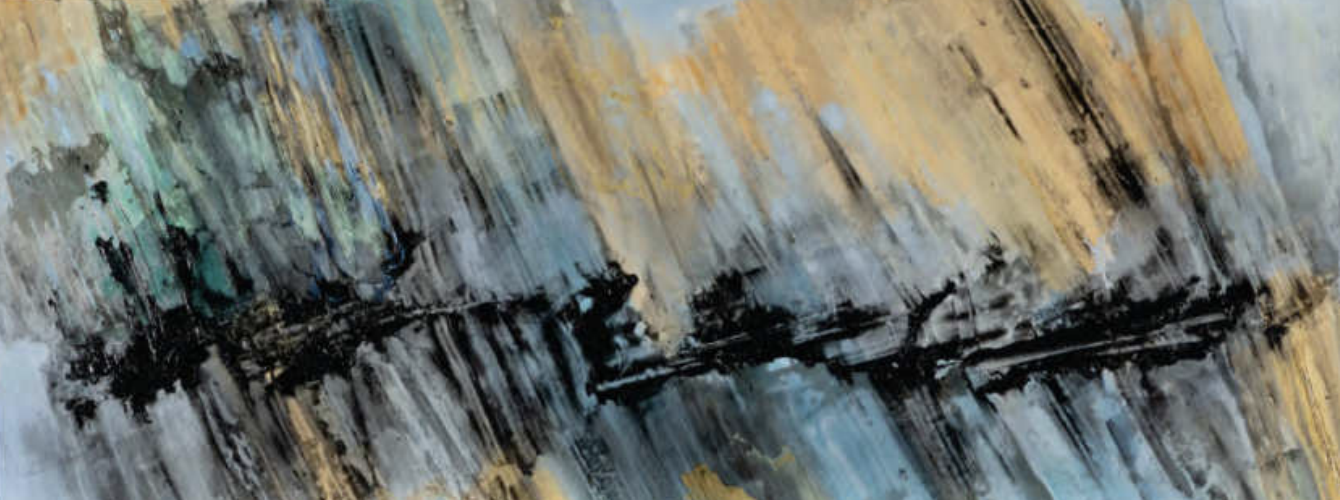
MINGUS MOVES
(1978)
Acrylic on canvas
78.7 x 172.7 cm
Collection of The Edmonton Art Gallery, purchased in 1978 with funds donated by the Clifford E. Lee Foundation.
Photo in black & white: Eleanore Lazare
Following his first solo exhibit, Terrence Keller developed more finesse as a painter, yet always keeping that original quality. Elegance is not an unlikely description to be applied to his work of those early years.
His development following his first EAG show was steady and without dramatic twists and turns. The components of his art, things like the emphasis on drawing and textural contrasts, remained constant.
After his show at the gallery, the changes that occurred, for the most part, involved working out ways to enlarge the scope of his expression. His pieces began to display a distinctive motif that he repeated with variations in his art. Keller’s motif consisted of a central spine or spines, generally a long, ragged stroke of thicker paint, abutted by a “thatched” pattern-work of short, dry brushstrokes.
His paintings became more “allover” with a more equal emphasis on the surface, and the regularity of the format design allowed him to shift his attention from the design of the pictures to the handling of the paint.
In the late 70s, Keller shifted his focus from the design of the picture to the handling of the paint. And more importantly, to the colour.
His talent for colour began to assert itself and develop. He began to experiment with blending and juxtaposing hues, sometimes treating the centre spine as a single colour bar to contrast with the multi-hued ground.
In his painting Mingus Moves, 1978, he located the colour of the spine closer to that of the ground. He chose to let the contrast of the texture between the bar and the ground work to subtly detach the bar from the thatch-work field of strokes that surrounded it.
Although colour was also the issue, it was colour expressed as nuance rather than contrasted effect.
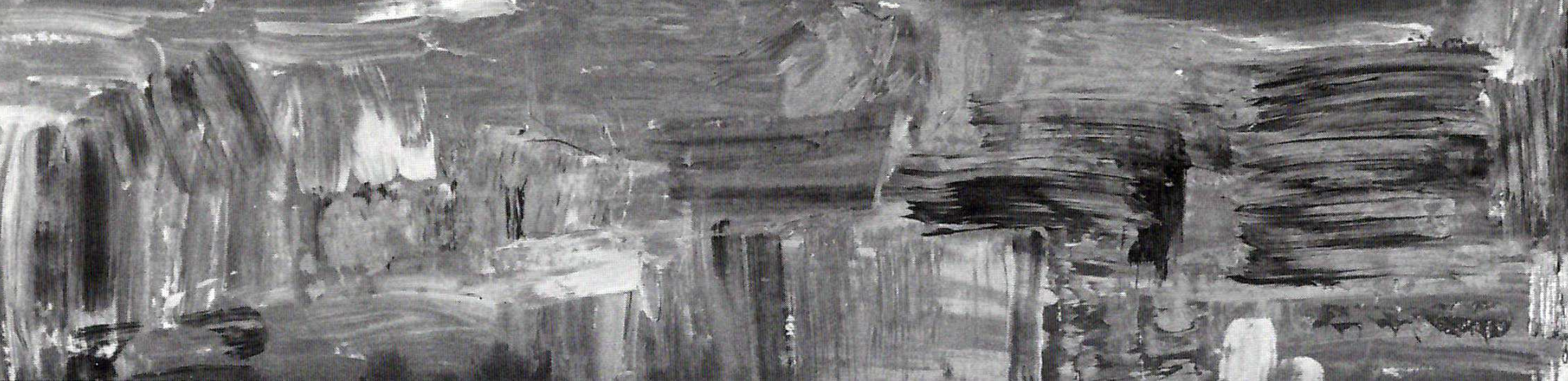
LADY PERSUADER
(1981)
Acrylic on canvas
71.0 x 186.8 cm
Collection of The Edmonton Art Gallery, purchased in 1981 with funds donated by the E.E.Poole Foundation and matched by funds from the Canadian Council Art Bank.
Photo in black & white: Eleanore Lazare
In 1981, Keller began experimenting with long, narrow picture shapes and this had a dramatic effect on the compositional structuring of his paintings. The radical proportions of the long rectangle forced the pictorial arrangement into a lateral, frieze-like configuration.
It seemed that the outside shape of his work took over some of the organizational role previously occupied by the spine-and-feathered-brushstroke format and he was able to compose more freely. Without the organizing spines, the brushstroke fields started to become the total content of his paintings.
The new technique was most apparent in a painting called Lady Persuader, 1981, a work owned by the Edmonton Art Gallery. Here he used brushstrokes that are arranged in clustered blocks, like interlocking stones. He chose to use pink as the dominant hues, but his other colours of umber, tan, dark blue, white, and pale green all blend and overlap in a loose, seemingly casual way.
As with all his paintings at this point, Lady Persuader has an open breathing quality created by Keller’s technique of dry-brushing the paint over the surface like an open mesh screen. His experimentation with thicker paint bodies led to the surfaces in his art fusing into a denser kind of paint fabric, yet there is still the visual effect in the paintings of interlocking strokes aligned parallel to the paint surface.